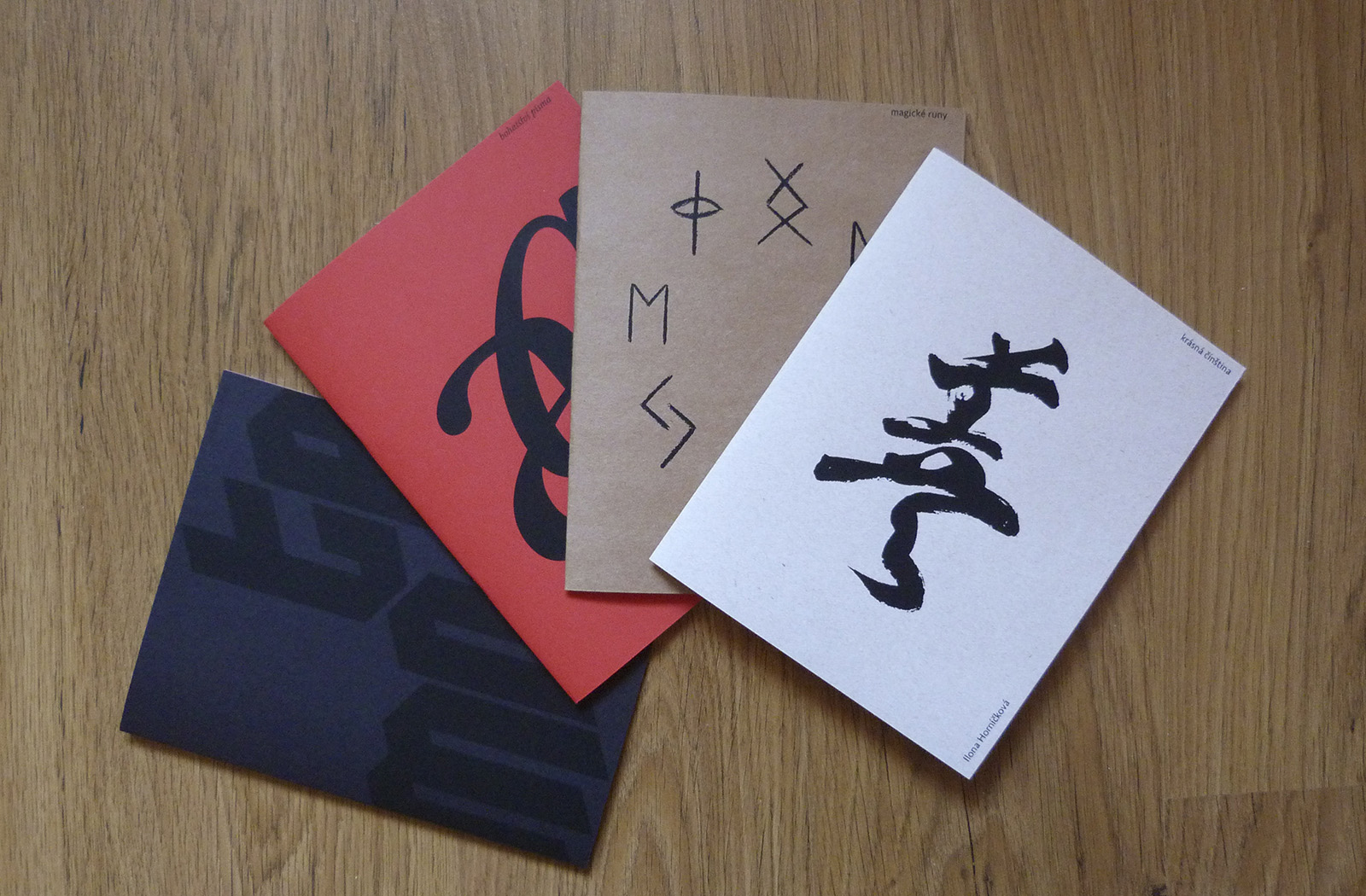
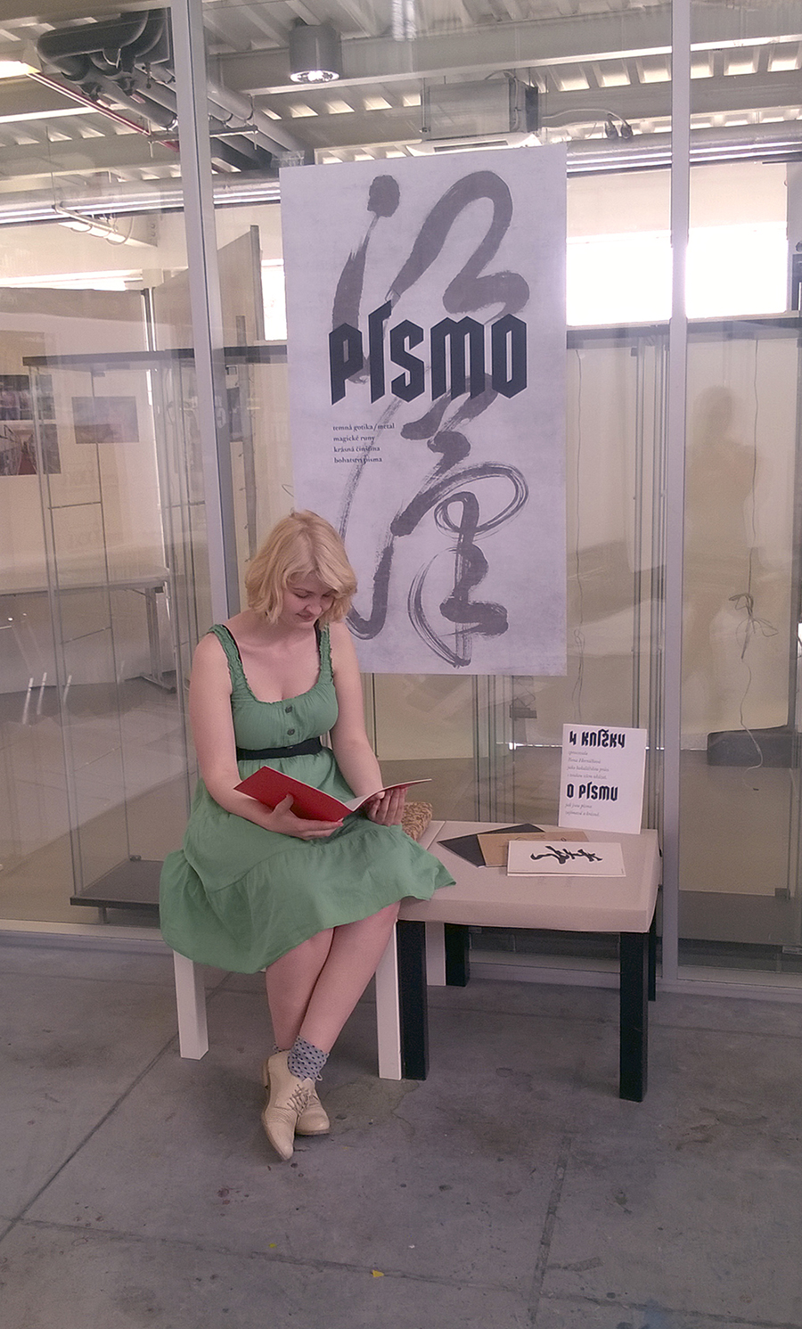
KNÍŽKY O PÍSMU – BAKALÁŘSKÁ PRÁCE
Knížky zajímavou formou upozorňují na fenomén písma.
Navržený koncept je založen na nové neotřelé myšlence ukázat písmo v jiném kontextu, než jsme normálně zvyklí.
Knížka o gotice a metalu upozorňuje na vtipnou podobnost, kterou, domnívám se, nikoho zatím nenapadlo ukázat.
Magické runy zase upozorňují na fakt, že písmo nemusí být jen nositelem sdělení, ale také součást magických rituálů.
Čínské znaky reflektují jiné vnímání světa. Znalost čínského písma nám tak může poskytnout pohled i do způsobů naprosto odlišného myšlení.
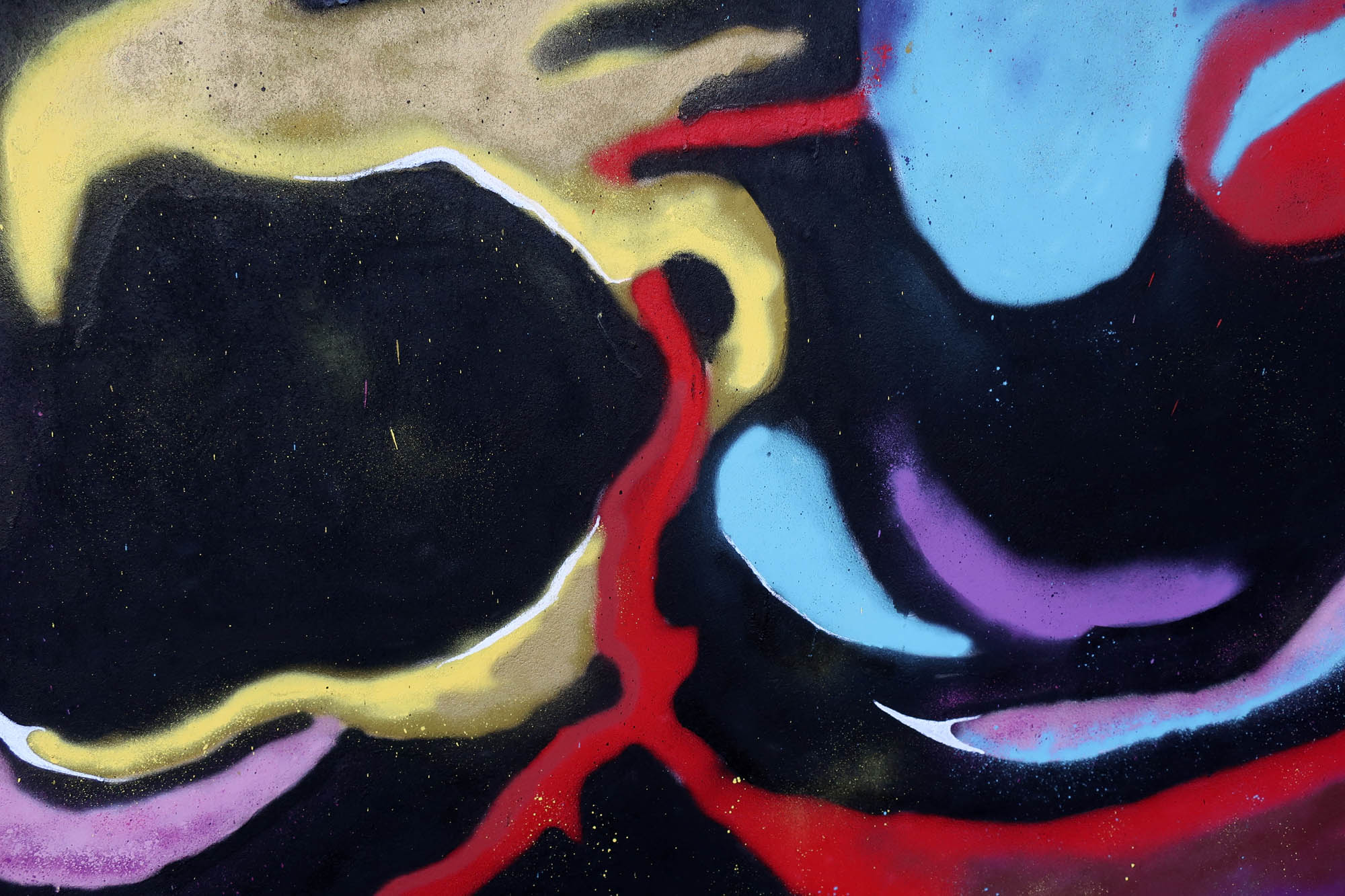
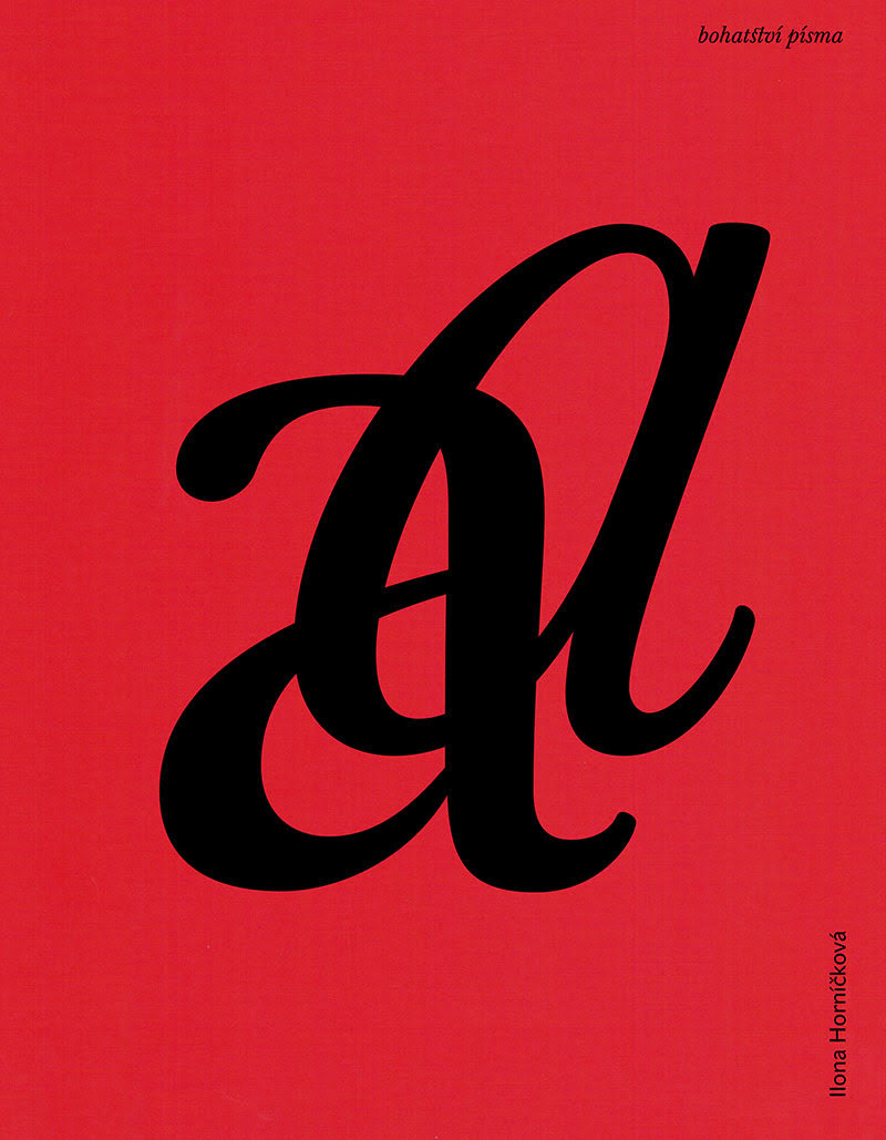
Bohatství písma názorně ukazuje rozdíly mezi písmy latinkového typu. Ač se jedná o stále stejný způsob zapsání jazyka, podoby jsou rozdílné. A rozdílnost je to krásná!
bakalářská práce, 2016
Všechny 4 knížky mají jednotný formát 210 × 270 mm.
Jsou tištěny digitálním tiskem, obálky sítotiskem.
Projekt byl oceněn v soutěži "Nejkrásnější česká kniha 2016".
Dobrý studentský design, 2018.
BOOKS ABOUT TYPEFACES—UNDERGRADUATE THESIS
The proposed concept aims to show the typeface in an unfamiliar context.
The book about the gothic period and heavy-metal draw attention to their quite funny resemblance, which, I suppose, no one has presented yet.
Magic runes point out the fact that the typeface doesn’t have to be just a bearer of information but also play a role in magic rituals.
Chinese characters reflect a different worldview. Knowledge of the Chinese script can provide us with a view to a totally different thinking.
Typeface richness graphically shows the difference between longhand. Even though we are talking about the same way of writing the language, the forms are different. The difference is a very beautiful one!
Undergraduate thesis, 2016
Books have the same size 210 × 270 mm.
They are printed with digital prink, covers by silkscreen
The project was awarded in the competition "The most beautiful Czech book of 2016".
Outstanding student design award, 2018.
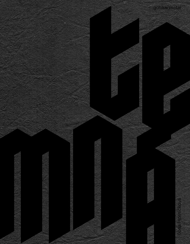
TEMNÁ GOTIKA / METAL
Na první pohled neslučitelné – gotický sloh a hudební žánr heavy metal. Na druhé straně mnoho společných znaků.
DARK GOTHIC/METAL
At first glance, the two things are incompatible–the gothic style and the music genre heavy metal. On second thought, we can see plenty of common attributes!
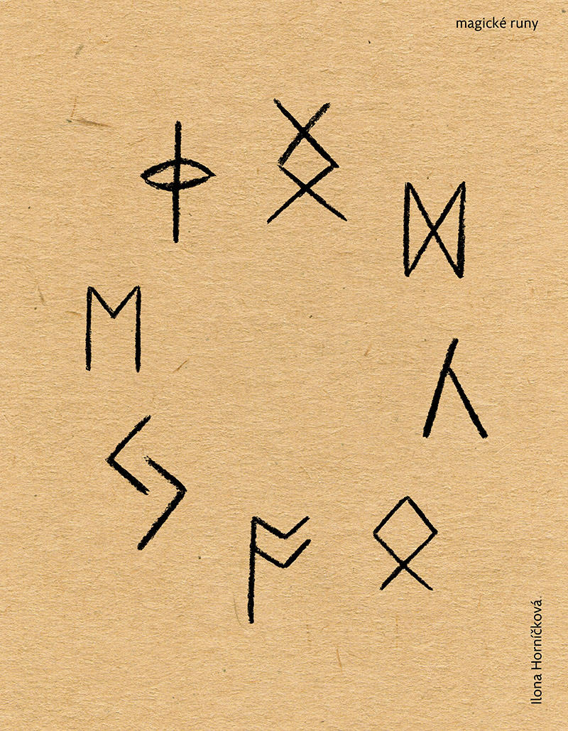
MAGICKÉ RUNY
Runy jsou velmi zajímavé tím, že od počátku svého vzniku byly spojovány s magickými obřady.
V severské literatuře najdeme množství příběhů o zaříkávání run. Magická moc run byla naprosto zásadní a dá se říci, že i prioritní.
Proto jsem se rozhodla toto zajímavé téma zpracovat a klást důraz na tajemno kolem tohoto písma.
MAGIC RUNES
Runes are very interesting because from the beginning they were connected to magic ceremonies.
In Norman mythology we can find many stories about the spells of runes. Their magical power was essential and one could argue that it took priority over their primary meaning.
This was the reason why I decided to work on this theme and to emphasize the mystery around these characters.
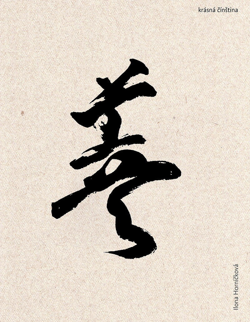
KRÁSNÁ ČÍNŠTINA
Čínské písmo je nejstarší ze všech dosud užívaných písem. Čínské písmo je pro nás Evropany systém, u kterého vnímáme pouze vizuální stránku. Pokud jazyk a písmo neznáme, vnímáme pouze formu.
V knížce jsem uvedla, jak písmo funguje, ale zaměřila jsem se především na vizuální krásu písma a s tím související kaligrafii.
BEAUTIFUL CHINESE
Chinese characters are the oldest written form still in use today. If we don’t know the language and recognize the characters, we will perceive only their form, their visual aspect. Therefore, we can perceive their beauty more strongly.
In the book I introduced how the characters work, and I especially focused on the visual beauty of characters and how it relates to calligraphy.
STÁHNOUT
DOWNLOAD
další autorská písma a knihy
other author typefaces and books