
Malá recenze kaligrafického písma/A brief review of a calligraphic typeface
🇺🇸 English below
Mojí nejoblíbenější prokrastinací je brouzdání po webech tvůrců písma. Při nedávné večerní zábavě mi do oka padlo písmo Pepone od Františka Štorma. (Storm Type Foundry) Písmo není horkou novinkou, doma mi leží vzorník, ale až teď mě písmo zaujalo.
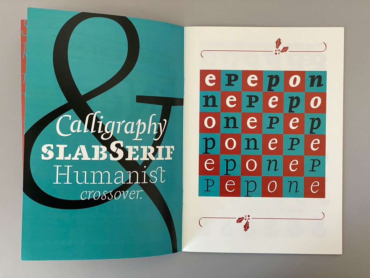
Vzorníky od Štorma jsou na můj vkus přeplněné texty. Ve snaze ukázat všechny řezy, ozdobné litery, dekorativní iniciály či ligatury, se ztrácí primární krása písma.
Písma od Štorma ale miluji. Mají unikátní charakter, jsou nádherně prokreslená a vždy dokonale řemeslně zpracována. Mým nejoblíbenějším písmem po léta zůstává jeho digitalizace Baskervillu.
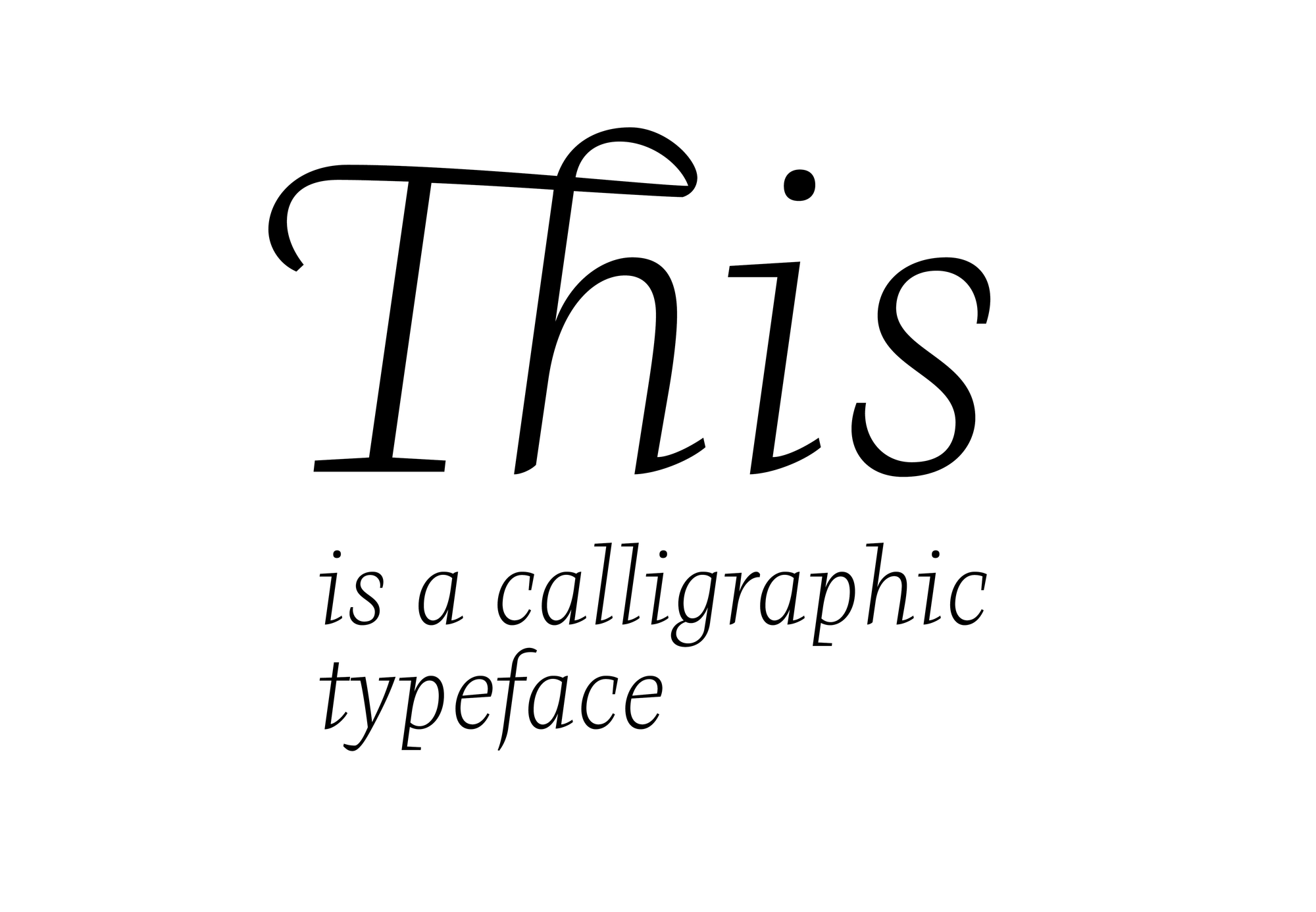
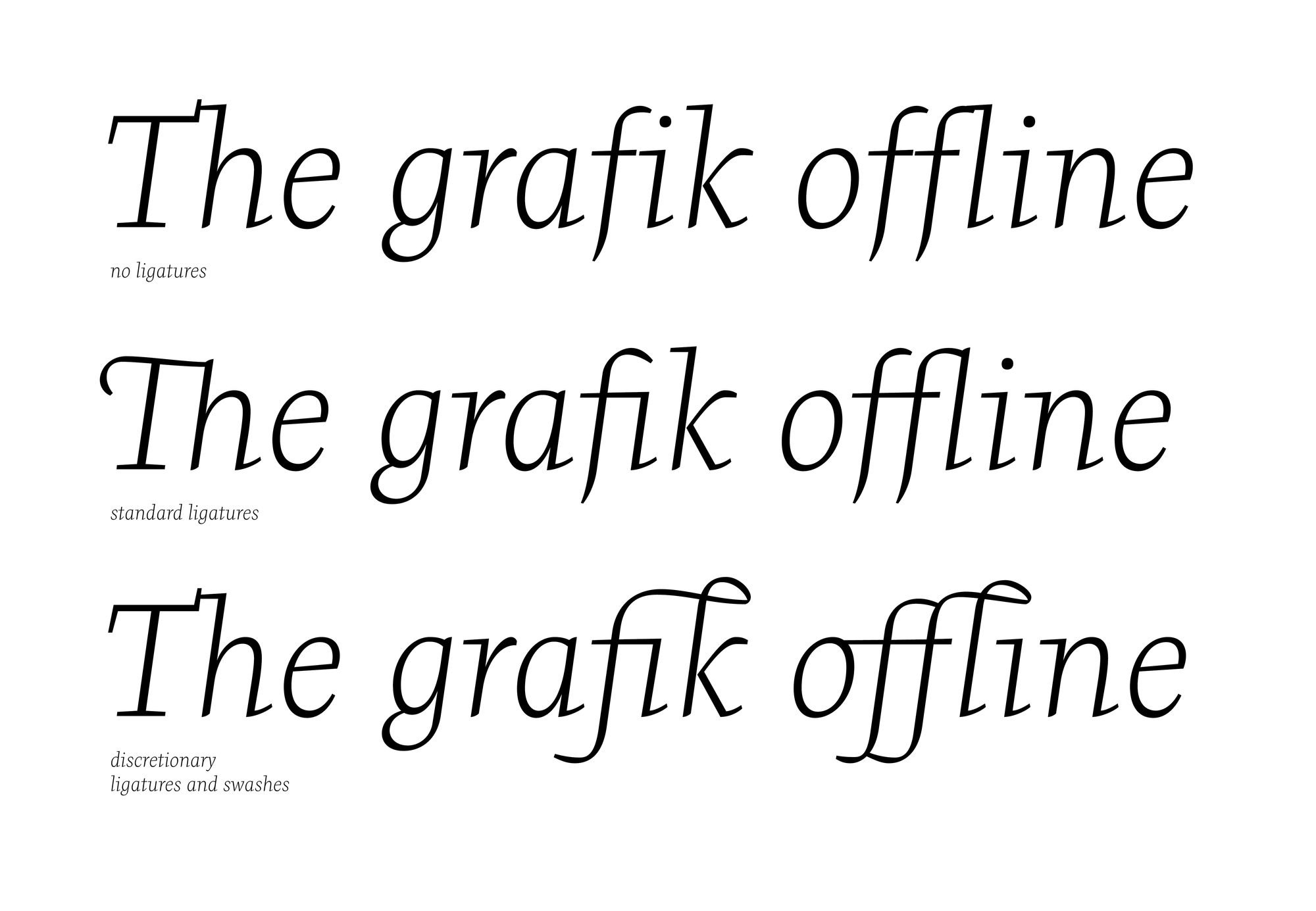
Písmo Pepone je určeno primárně k sazbě krásné literatury. Celá rodina písma ale obsahuje řezy vhodné k použití i ve velkých velikostech např. na plakáty. Zalíbil se mi řez Light Italic, který působí kaligraficky a je nesmírně elegantní.
I písmo typografické může mít kaligrafickou křehkost.
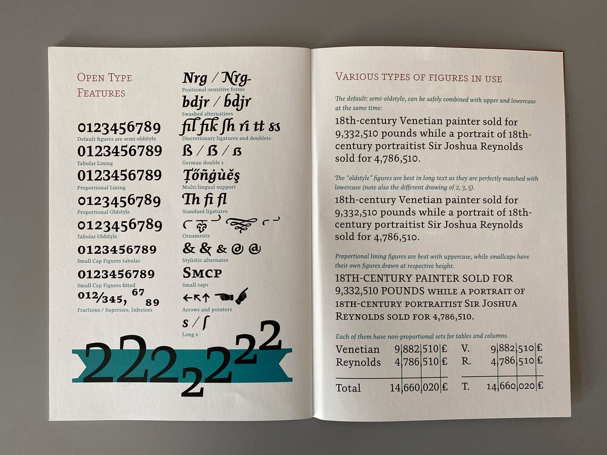
Písmo nabízí grafikům bohaté Open Type funkce.
Písmo k prohlédnutí a zakoupení zde: https://www.stormtype.com/families/pepone
Pronajmout si ho můžete v bezvadné aplikaci Fontstand: https://fontstand.com/
ENGLISH VERSION
A brief review of a calligraphic typeface
My favorite procrastination is browsing websites of type foundries .
During a recent evening session the Pepone typeface by František Štorm (Storm Type Foundry) caught my eye. The typeface is not new - I have a specimen sheet at home - but only now I got interested in it.
The specimens from Štorm are filled with too much text for my taste. The primary beauty of typeface is lost because there are too many features on display in the small space – many styles, decorative letters, initials or ligatures.
However, I love typefaces by Štorm's foundry. They have a unique character, they are well drawn and always perfectly crafted. My most favourite typeface is their digitalisation of the John Baskerville typeface.
Pepone is primarily designed for book typesetting. However, the font family contains styles suitable for use in large formats, e.g. for posters. I like the Light Italic style, which looks calligraphic and is very elegant. The font offers rich Open Type features for graphic designers.
Even typographic typefaces can have calligraphic fragility.
I am most impressed by the decorative ligatures. I am definitely not the only one!
View and purchase the font here: https://www.stormtype.com/families/pepone
You can also rent it via the perfect Fontstand app: https://fontstand.com/